Introduction
About the software
BioVinci 2.0 empowers biologists with the latest advancements in data visualizations and machine learning algorithms to make breakthroughs in life sciences.
The software allows scientists, without programming experiences, to quickly apply state-of-the-art machine learning techniques on their data and elegantly visualize the results to gain insights, otherwise, difficult to obtain.
We specially focus on the design of BioVinci 2.0 to make it friendly even for first-time users. While having a wide range of plot configurations to serve different needs of users, we hope to bring the aesthetics, simplicity, interactive, publication-ready, and information revealing in every plot.
BioVinci 2.0 was first released in February of 2020, running on Windows, and macOS.
System requirements
Operating systems
- Windows 10 (64-bit only).
- macOS: macOS High Sierra (10.13) or higher.
Network
- Ethernet connection (LAN) or a wireless adapter (Wi-Fi).
Hard drive
- Minimum 2 GB.
- Recommended 20 GB or above.
Memory (RAM)
- Minimum 8 GB.
- Recommended 16 GB or above.
Notice
- For an optimal experience with large tabular data containing more than 1000 rows x 1000 columns, please use a computer with the recommended configuration.
If you experience difficulties in running the software even after fulfilling all these requirements, please contact vinci@bioturing.com.
Installation
Windows
If you want to install BioVinci to your computer, download the installer .exe file and run it. The installation process will start automatically. If your computer has more than one account using the software, each account can only access its data.
macOS
To install BioVinci on macOS, after downloading the package:
- Navigate to the downloaded .dmg file.
- Double click the .dmg package to open the installation window.
- Follow the on-screen instructions to complete the installation process.
- Please remember to drag the BioVinci icon to the Applications folder.
Getting started
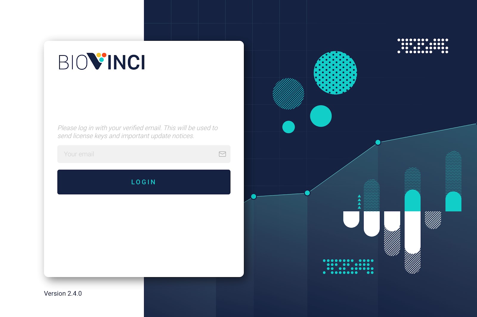
When you start BioVinci for the first time, you will see the Login window. Enter your email address and then click on the login button. This email will be used to send important update notices.
Once you have successfully logged in, you will see the BioVinci homepage.

Basic chart dashboard
The following short tutorial will show you how to create plots from BioVinci examples.
Step 1: Click on the “New Workset” button on the homepage.
Step 2: In the “New Workset” dialog, you will see two tabs representing two kinds of workset: one contains examples, and the other is for generating new plots. Click on the “Examples” tab.
Our examples are divided into 3 tabs: “Plot”, “Heatmap”, and “Dimensionality Reduction”. Choose the “Plot” tab.
Step 3: BioVinci has many examples that cover many common plots. Select the example of your interest, then click on the “Create” button.
Step 4: The software will create a workset for you and automatically draw the plot you see in the thumbnail of the examples.
From here, you can visualize your data in many different plots. For editing and advance configurations, see the documentation below.
Dimensionality reduction dashboard
The following short tutorial will show you how to perform dimensionality reduction from BioVinci examples.
Step 1: Click on the “New Workset” button on the homepage.
Step 2: In the “New Workset” dialog, you will see two tabs representing two kinds of workset: one contains examples, and the other is for generating new plots. Click on the “Examples” tab.
Our examples are divided into 3 tabs: “Plot”, “Heatmap”, and “Dimensionality Reduction”. Choose the “Dimensionality Reduction” tab.
Step 3: Select the example of your interest, then click on the “Create” button.
Step 4: In this example, we have applied different dimensionality reduction methods on the data. Click on the thumbnail to explore the result.
Step 5: You can switch between different dimensionality reduction methods, or adjust the current method parameters by clicking on the “Change method” button.
From here, you can extract the important features in our breast cancer data using the decision tree model. For more details about the decision tree model, and the methods we use for reducing the dimensions of the data, as well as submitting your own data, see the documentation below.
Heatmap dashboard
The following short tutorial will show you how to draw heatmap from BioVinci examples.
Step 1: Click on the “New Workset” button on the homepage.
Step 2: In the “New Workset” dialog, you will see two tabs representing two kinds of workset: one contains examples, and the other is for generating new plots. Click on the “Examples” tab.
Our examples are divided into 3 tabs: “Plot”, “Heatmap”, and “Dimensionality Reduction”. Choose the “Heatmap” tab.
Step 3: Select the example of your interest, then click on the “Create” button.
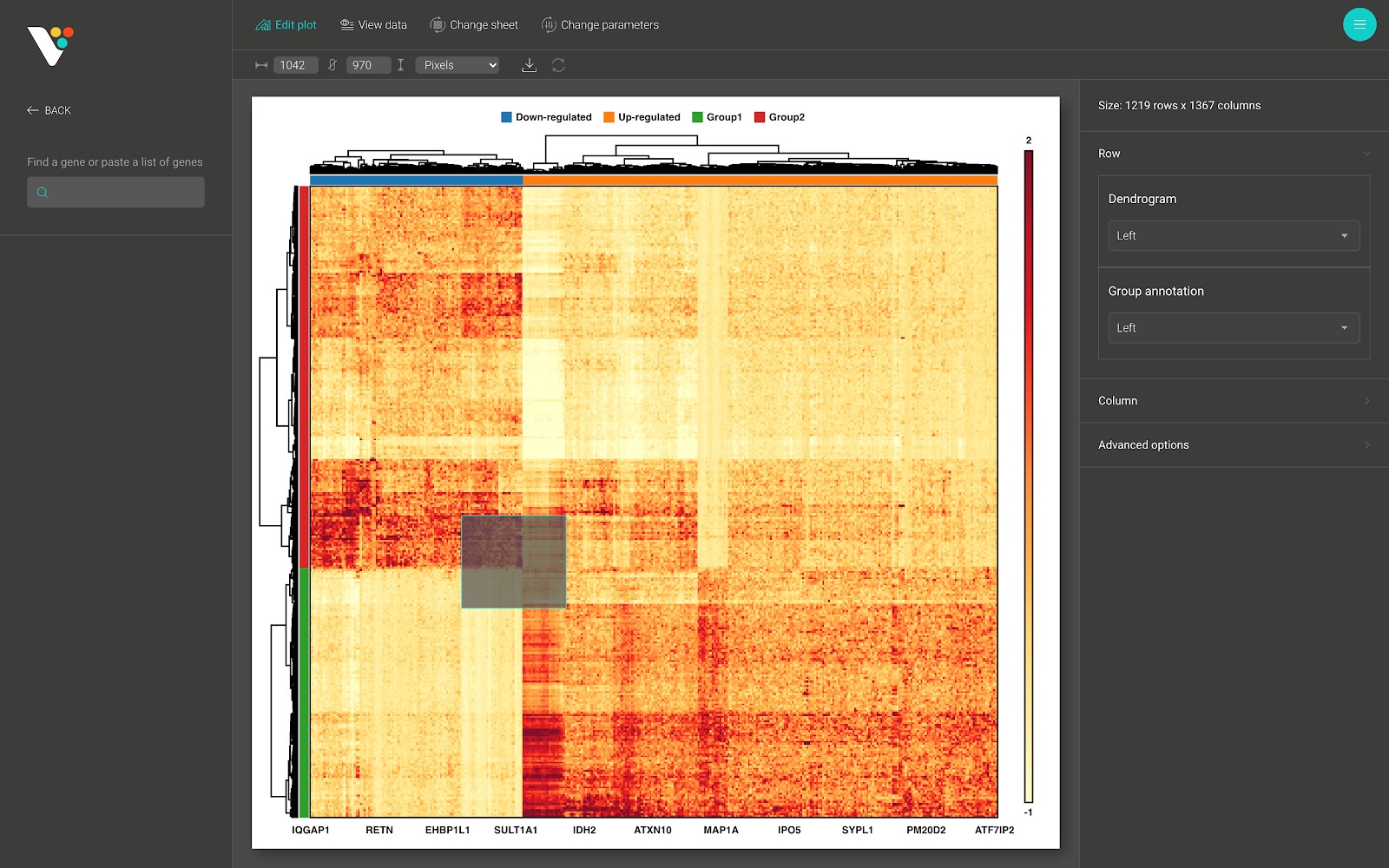
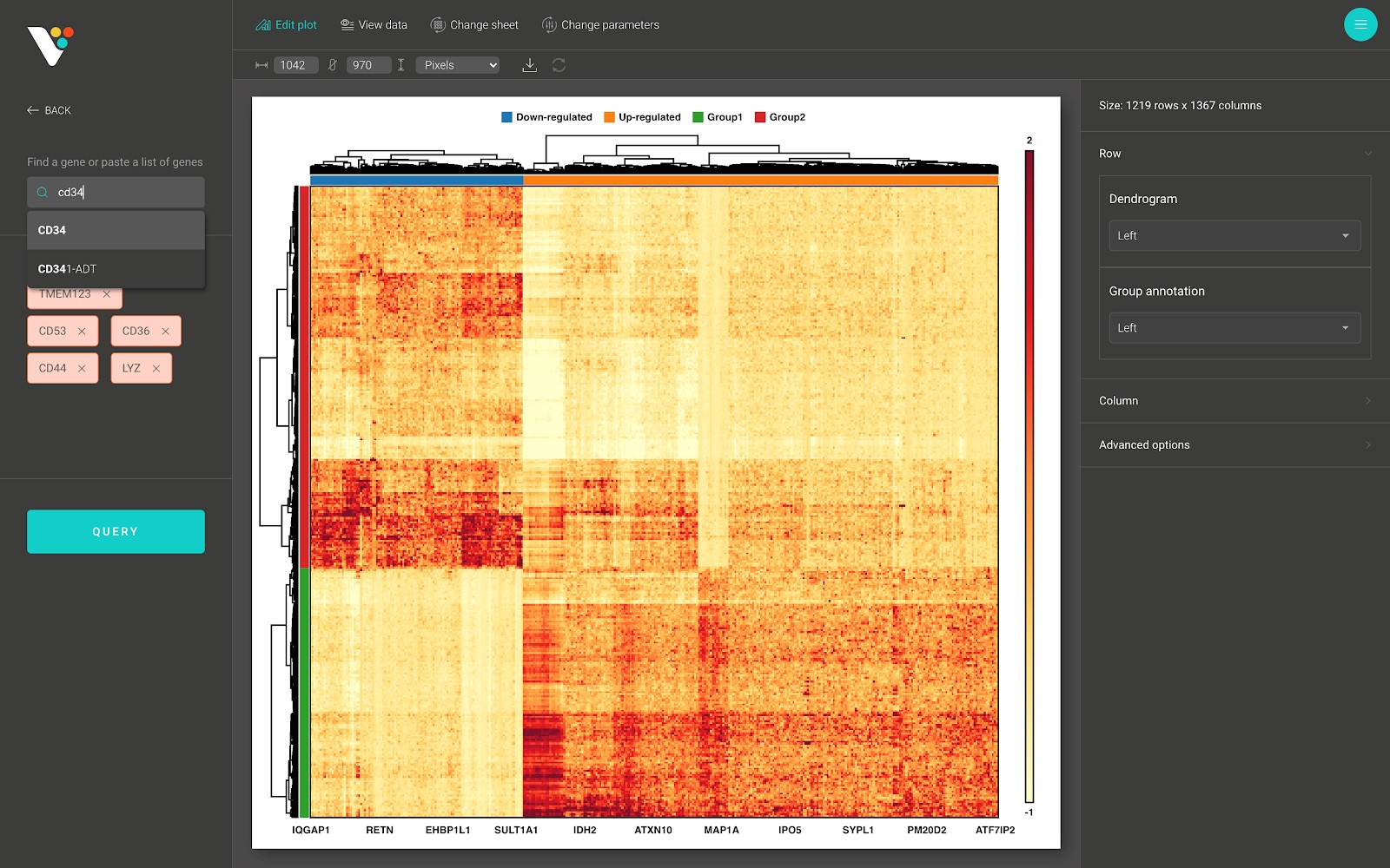
Step 4: In this example, we used the differential expression genes analysis result from BioTuring Browser. The data contains two groups: Group 1 and Group 2, and a column annotation contains two labels: Up-Regulated and Down-Regulated for classifying quantitative changes in gene expression levels between two groups.
We have already performed hierarchical clustering. You can easily see the pattern of the analysis result.
From here, you can interact with the heatmap by zooming in the region of interest. You further can subset the rows or columns to create a smaller heatmap. For more information about submitting your own data and labels, as well as customizing the heatmap, see the documentation below.
Importing data
BioVinci requires data in tabular format. Usually, the rows represent observations (or samples) and the columns represent variables (or features). Currently, BioVinci can only accept numeric values or text values, which means a column cannot have both numeric and text values.
Text file
BioVinci accepts tabular data in .tsv, .csv, or .xlsx format.
A .tsv or .csv file is simply a table in which values are separated by a delimiter. It can be a comma (in .csv) or a tab (in .tsv). If you use a table editor, such as Microsoft Excel, Apple Numbers, or Google Sheet, it can always export your table into either .csv or .tsv format.
A .xlsx is a Microsoft Excel Open XML Spreadsheet file created by Microsoft Excel 2007 or higher.
Binary file
If you are familiar with coding, you can use either Python or R to generate .feather files.
A .feather file is a tabular binary file format that can be read by both Python and R. Commonly, it is generated by package “feather” in R or module “pandas” in Python. Using .feather files will save your time in I/O operations.
Organizing your workset
Creating a new workset
- Click on the “New Workset” button on the homepage.
- In the “New Workset” dialog, you will see two tabs representing two kinds of workset: one contains examples, and the other is for generating new plots.
- Click on the “Examples” tab if you want to try our examples, follow the instructions here.
- Click on the “Upload” tab if you want to create plots or analyze your own data.
- A file explorer window will be opened. Navigate the directory and select your input file. Make sure that your input file is in supported formats. Then click on the “Create” button.
After that, the “Options” dialog box will appear. From here, select the “Basic chart” option for creating plots, or select the “Dimensionality reduction” option for performing dimensionality reduction on your data, or select the “Heatmap” option for drawing heatmap.
Accessing recent results quickly
You can quickly access your recent workset by clicking on the workset under the “Recent files” title. The “Saved results” panel will appear. You can click on the saved results to continue your work, or click on the “New” button to create a new plot or perform a new analysis on your data.
Renaming and deleting a workset
On the homepage, you can rename or delete your workset by hovering over the “three dots” button. A menu will appear, click on the operation you want to perform.
Note: Please be careful with the “Delete” workset operation. Once you delete your workset, it cannot be recovered.
Plotting with BioVinci
Overview
- After submitting your data and selecting the “Basic chart” option, BioVinci will navigate to the “Basic chart” dashboard.
- The data panel contains your data, each line represents the column name, and its type (numerical or text).
- You can search for a column by typing in the “Find a column” input field or add a new sheet by clicking on the “Add new sheet” button.
- You can rename or delete a sheet by clicking on the corresponding icon next to the sheet name.
- The input panel contains the required inputs for drawing a plot. Simply drag and drop the column name from the data panel to the input field to create your plot.
- Right next to the input panel is the plot menu. Each plot contains a set of different inputs. Click on the plot icon to draw the plot you want. You can switch between plots that have similar input values (e.g switching between violin plot and box plot).
- On top of the “Basic chart” dashboard is the toolbar:
- Click on the “Edit plot” button to edit your current plot.
- Click on the “View data” button to view details of your data, and perform simple data operation: Transpose, Normalization, and Standardization [Link].
- Click on the “Clear plot” button to clear your current plot.
- Click on “Undo” or “Redo” to undo, or redo your actions.
- Right below the toolbar is the utility bar:
- From here, you can change the chart size, export your plot to PNG or SVG image, and save your current plot to access it later.
Note: You can generate all of the images in this section using BioVinci example datasets.
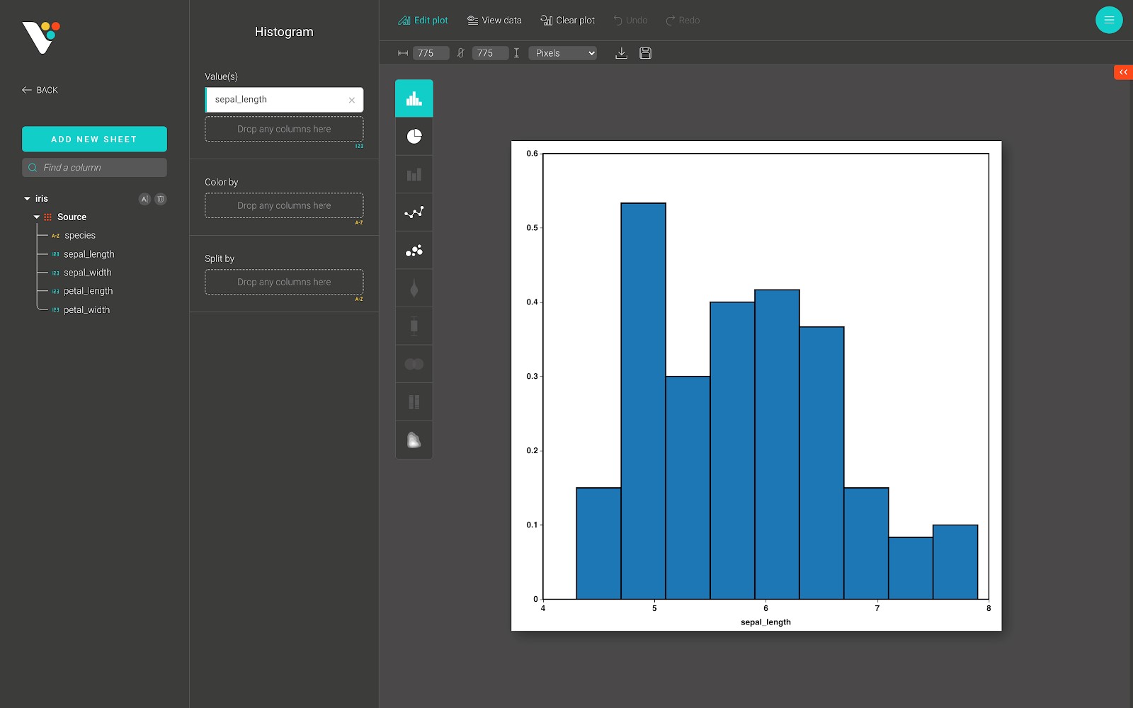
Histogram
The histogram plot is useful for representing the distribution of continuous numerical data.
To construct a histogram, the first step is to “bin” the range of values and then count how many values fall into each interval.
In BioVinci, these two steps are done automatically. All you need to do is simply drag-and-drop the continuous numerical column into the “Value(s)” input field, as in the figure below.
For advanced customization, go to the “Edit plot” dashboard, and click on the “Configuration” tab on the top right corner of the screen.
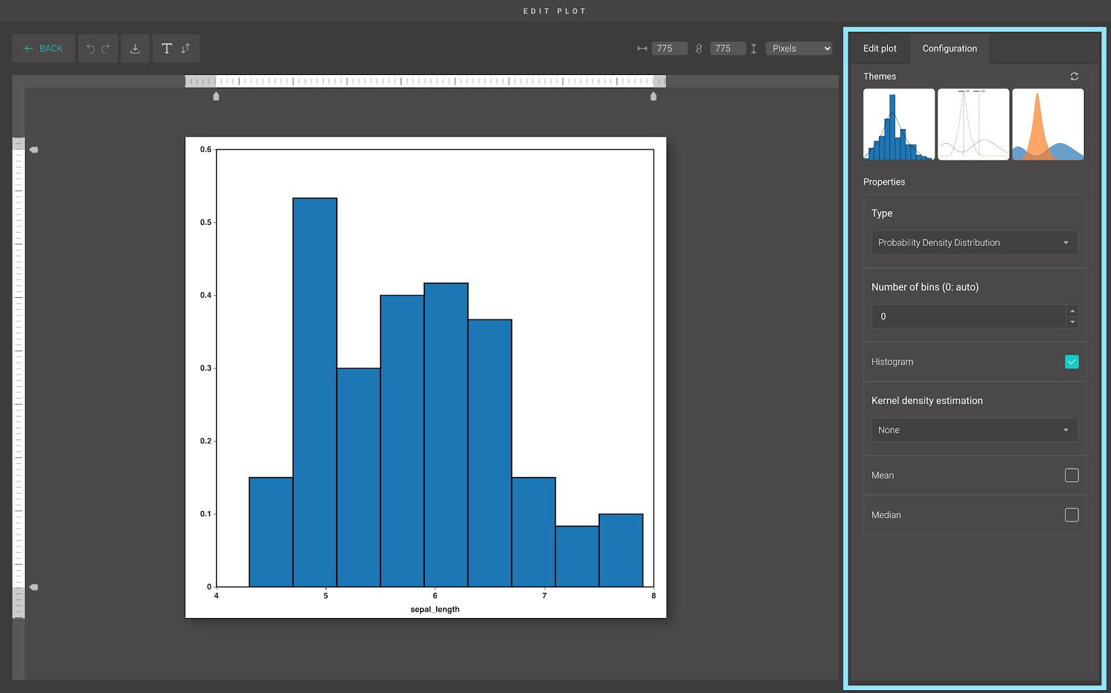
In the “Configuration” tab, we provide a set of themes to help you quickly customize your plot. Below the “Themes” section is the advanced configuration options. Including:
- Type:
BioVinci supports several types of histogram, including:
- Frequency histogram: Sum bar heights to find the number of data points in range.
- Discrete probability histogram: Sum bar heights to find the probability of data falling in range.
- Discrete percentage probability histogram: Sum bar heights to find the percent probability of data falling in range.
- Frequency density histogram: Sum product of bar heights and bin width to find the number of data points in range.
- Probability density histogram: Sum product of bar heights and bin width to find the probability of data falling in range.
The default histogram in BioVinci is the Probability density histogram.
- The number of bins (0 means ‘Auto’):
By default, the number of histogram bins in BioVinci is the maximum number of bins calculated by Freedman-Diaconis rule, and Sturges rule.
If you want to define the number of bins, enter the number you want into the input field.
- Display histogram:
In some cases, you need to hide the histogram. Untick the “Histogram” option to hide the histogram, tick the option to show it again.
- Kernel density estimation:
Kernel density estimation is a way to estimate the probability density function (PDF) of a random variable in a non-parametric way.
BioVinci estimates the probability density function of your histogram by using the Gaussian kernel.
By default, the visualization of the probability density function is hidden. But you can always display it by choosing the option “Line” or “Area”.
- The mean and median options:
You can show the mean or median line of your histogram by ticking on the “Mean” or the “Median” option accordingly. They are useful for comparing the mean or the median between two distributions.
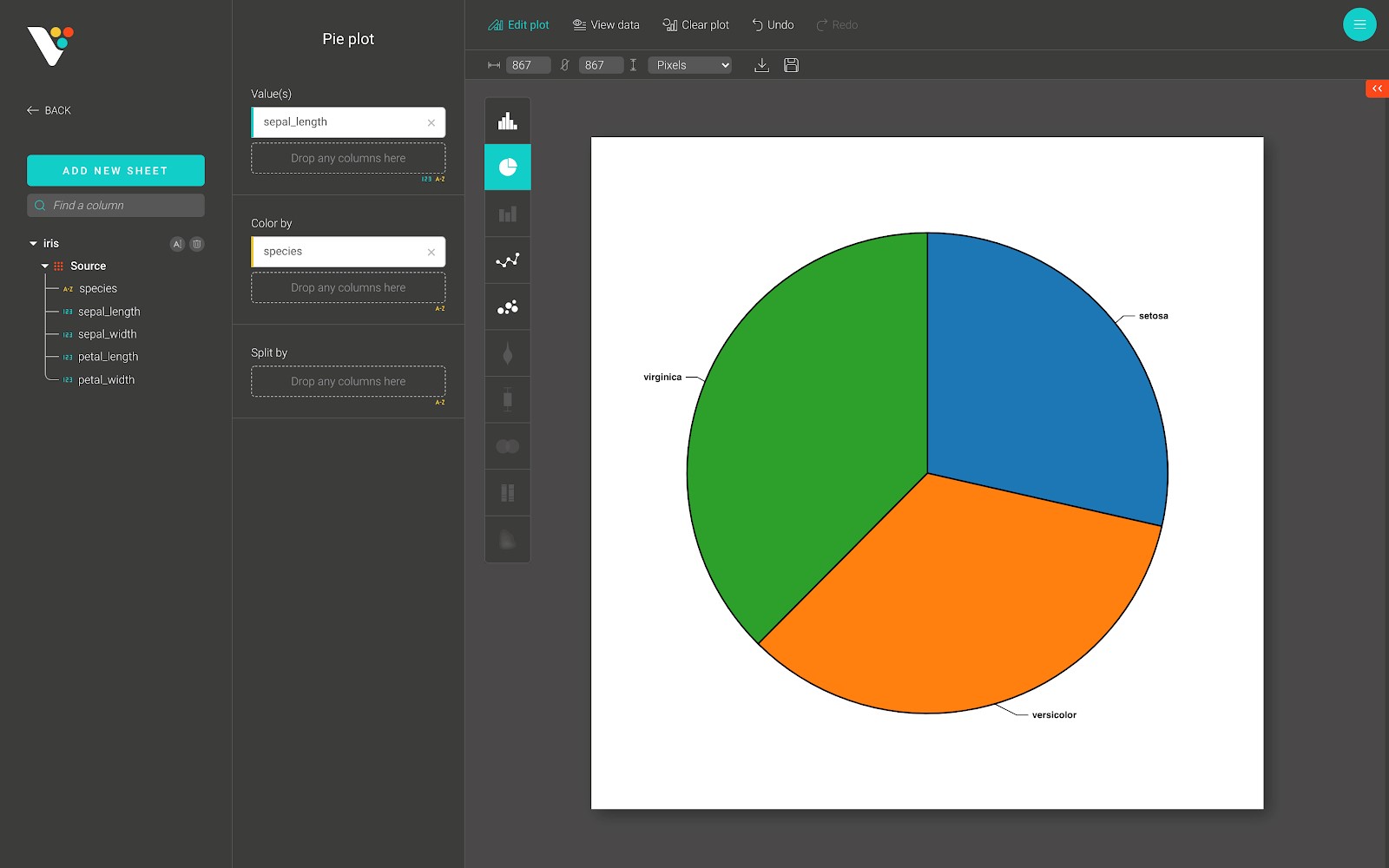
Pie
A pie plot (or a circle plot) is a circular statistical graphic, which is divided into slices to illustrate numerical proportions. It is widely used in the business world and the mass media.
However, it is difficult to compare different sections of a given pie plot or to compare data across different pie plots. Pie plots can be replaced in most cases by other plots such as bar plot, box plot,...
Below is an example of a pie plot in BioVinci.
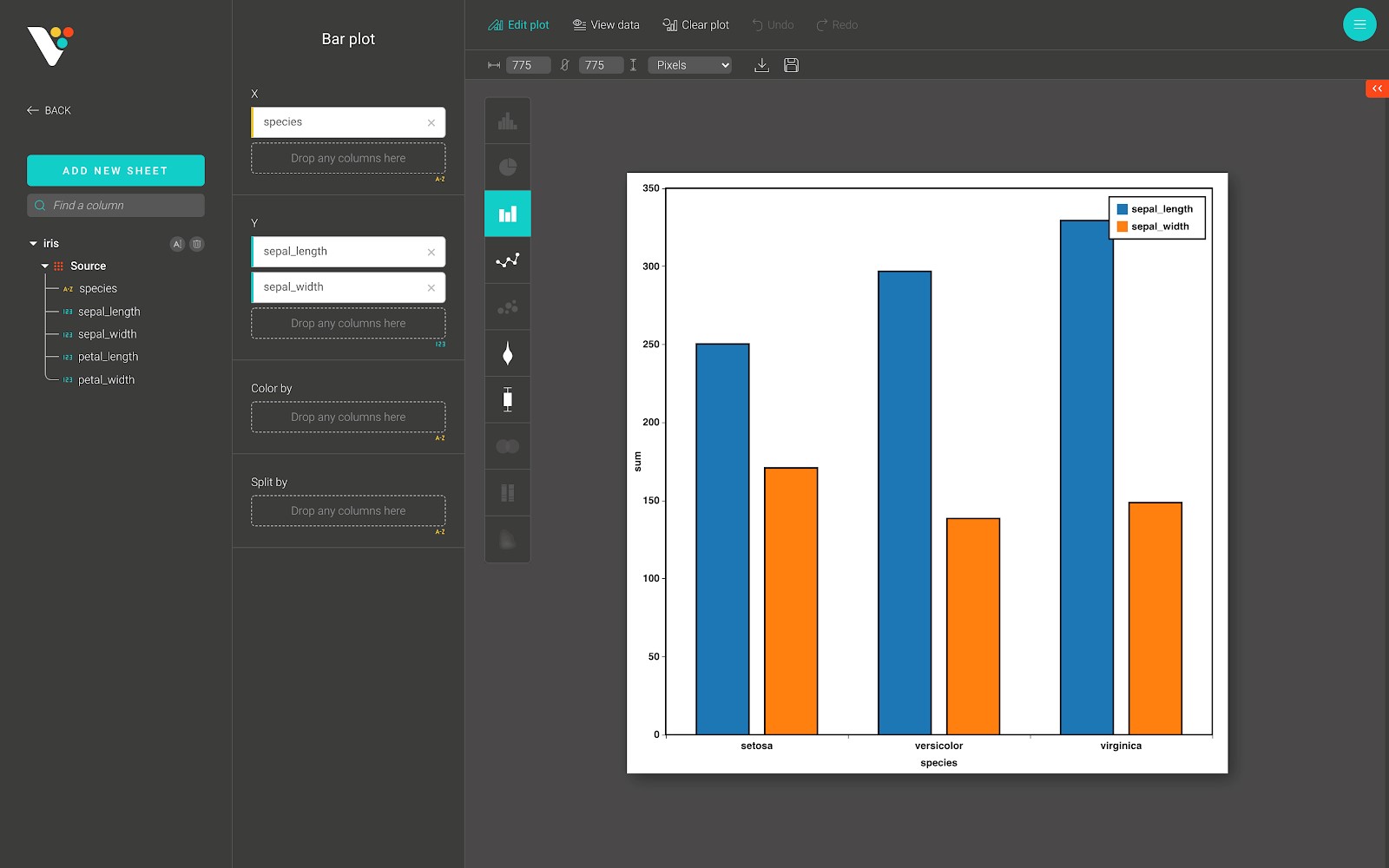
Bar
The bar plot is useful for representing categorical data with rectangular bars with heights or lengths proportional to the values that they represent.
In BioVinci, the bar plot can be plotted vertically or horizontally. One axis of the plot shows the specific categories being compared, and the other axis represents a measured value.
Below is an example of a bar plot in BioVinci.
For advanced customization, go to the “Edit plot” dashboard, and click on the “Configuration” tab on the top right corner of the screen.
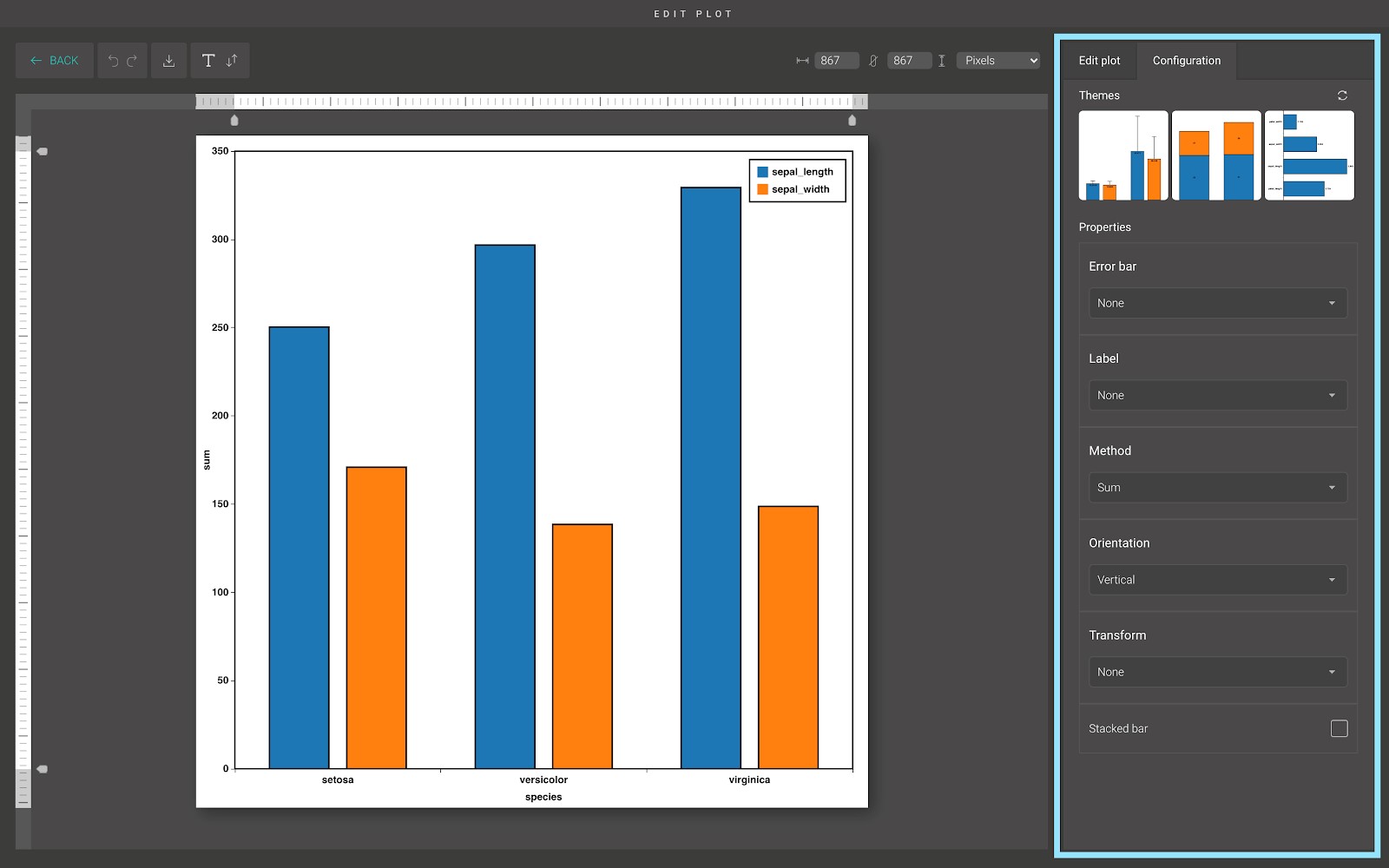
In the “Configuration” tab, we provide a set of themes to help you quickly customize your plot. Below the “Themes” section is the advanced configuration options. Including:
- Error bar:
You can display the error bar to indicate the error or uncertainty in a reported measurement. BioVinci supports two types of error bar:
- The “standard deviation error” error bar.
- The “standard error of the mean” error bar.
- Label:
You can display the label of each bar to bring more information to your plot. They can be put in different positions:
- Middle.
- Top.
- Inside top.
- Inside bottom.
- Method:
BioVinci provides different methods to calculate the bar heights. Including:
- Count: The number of values in each category.
- Sum: The sum of the values in each category.
- Mean: The mean of the values in each category.
- Median: The median of the values in each category.
- Orientation:
You can plot the bar plot horizontally or vertically by using this option.
- Transform and Stacked bar:
The stacked bar plot represents different groups on top of each other. The height of the resulting bar shows the combined result of the groups.
If you want to plot a stacked bar plot, change the “Transform” option to “Percentage” and tick on the “Stacked bar” option. If you want to make more complex comparisons of data, use the “Composition plot”.
However, stacked bar plots are not suited to data sets where some groups have negative values. In such cases, the grouped bar plot is preferable.
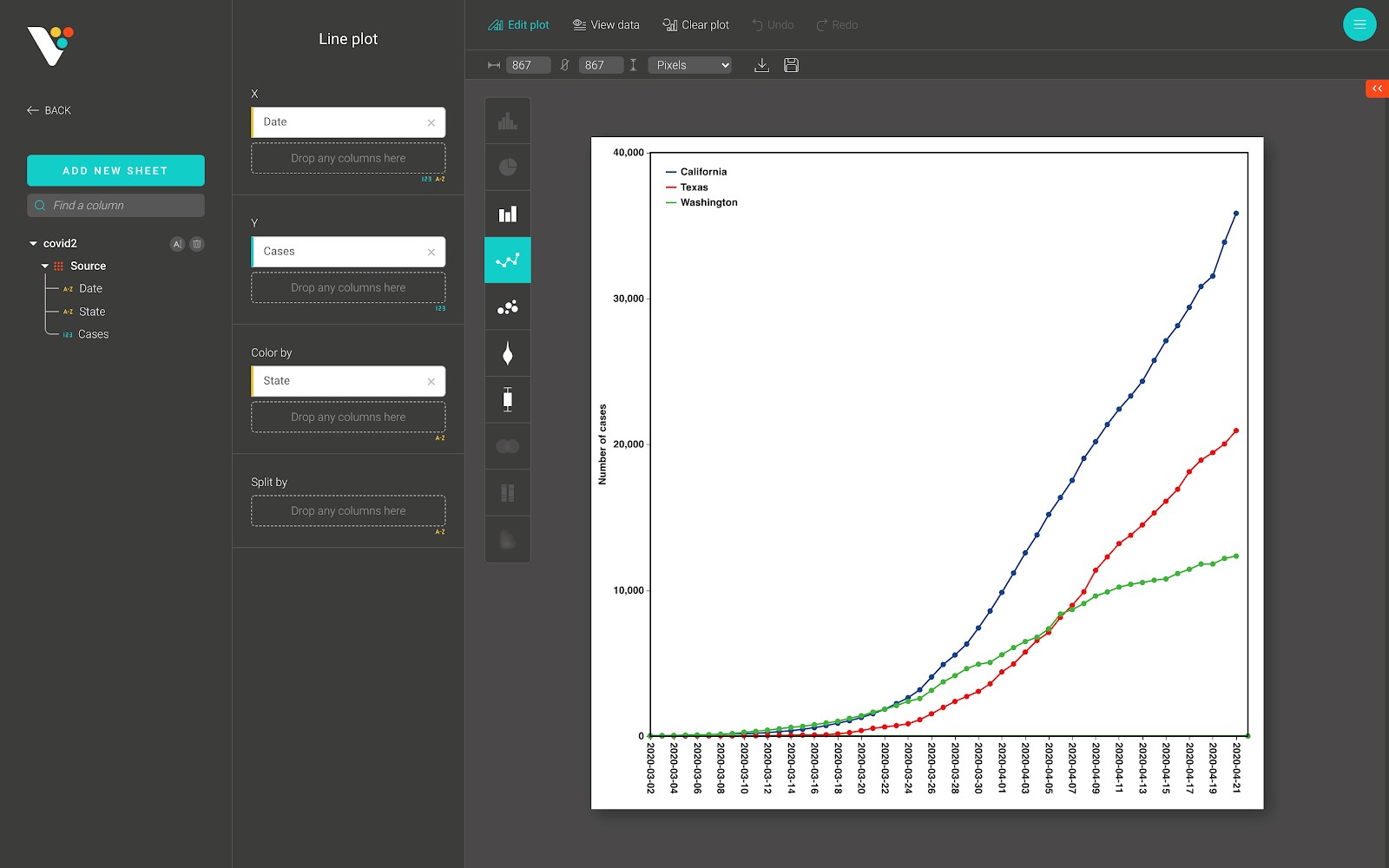
Line
A line plot displays information as a series of data points called 'markers' connected by straight line segments. It is a basic type of chart in many fields. It is similar to a scatter plot except that the measurement points are ordered (typically by their x-axis value) and joined with straight line segments. A line plot is often used to visualize a trend in data over time.
Below is a line plot from BioVinci:
For advanced customization, go to the “Edit plot” dashboard, and click on the “Configuration” tab on the top right corner of the screen.
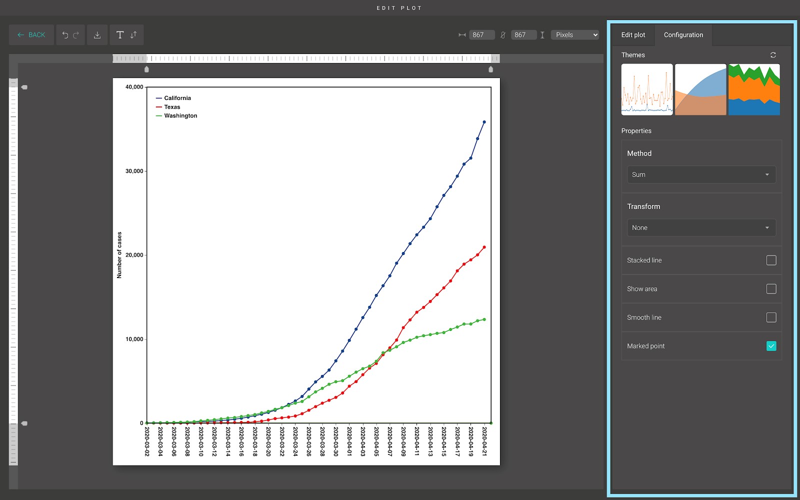
In the “Configuration” tab, we provide a set of themes to help you quickly customize your plot. Below the “Themes” section is the advanced configuration options. From here, you can choose between different methods to calculate the marked points, stack the line on top of each other, or show the area under the line.
Scatter
A scatter plot is a type of plot or mathematical diagram using Cartesian coordinates to display values for typically two variables for a set of data. If the points are coded (color/shape/size), one additional variable can be displayed. The data are displayed as a collection of points, each having the value of one variable determining the position on the horizontal axis and the value of the other variable determining the position on the vertical axis.
Below is a scatter plot from BioVinci.
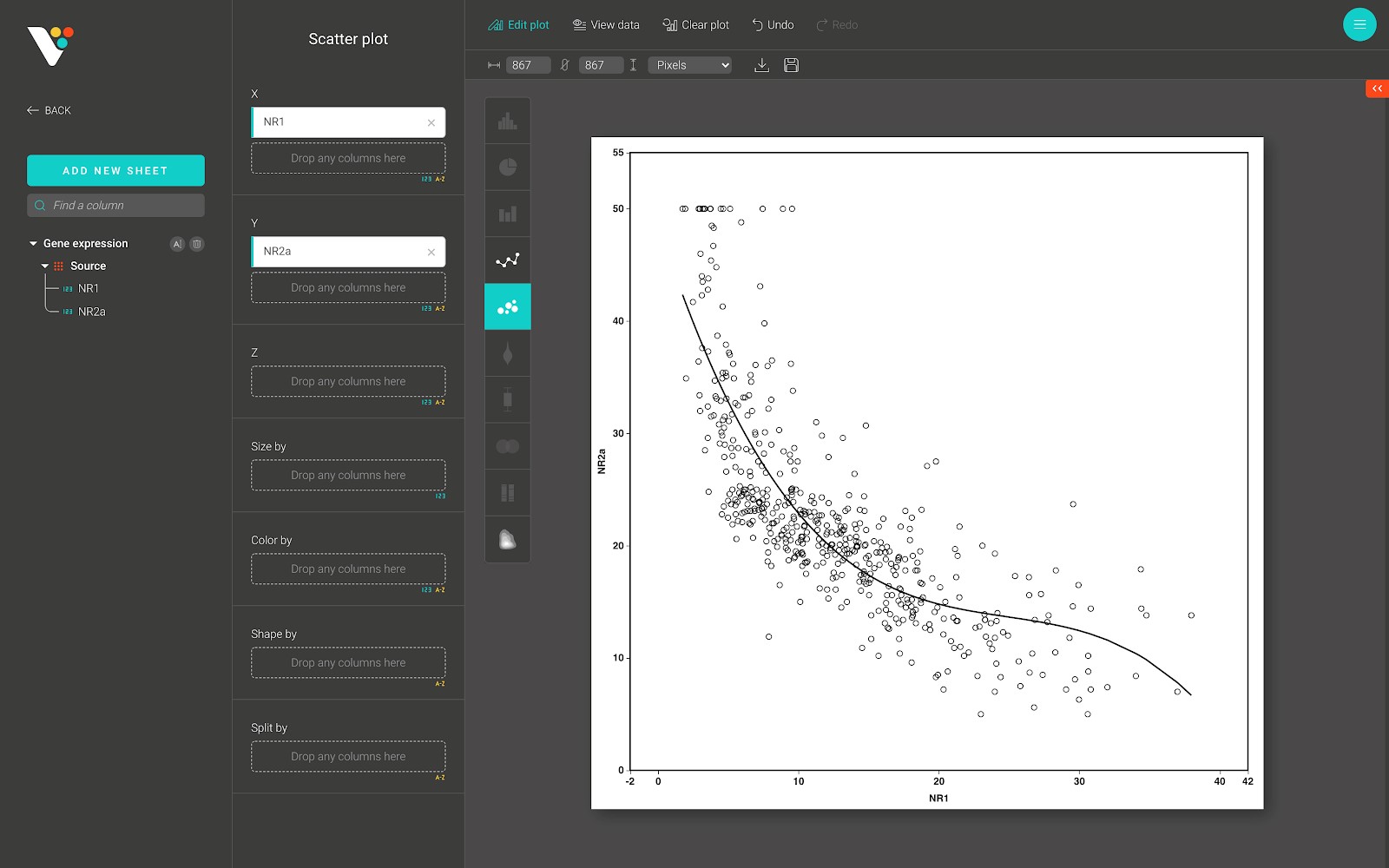
For advanced customization, go to the “Edit plot” dashboard, and click on the “Configuration” tab on the top right corner of the screen.

From here, you can draw a regression line to predict the trend of your data.
If the degree is equal to 1, BioVinci performs the “Ordinary least squares Linear Regression” and the resulting line is straight.
If the degree is greater than 1, BioVinci generates polynomial and interaction features, which is a new feature matrix consisting of all polynomial combinations of the features with the degree less than or equal to the specified degree.
Box
A boxplot is a standardized way of displaying the dataset based on a five-number summary: the minimum, the maximum, the sample median, and the first and third quartiles.
Below is a box plot from BioVinci:
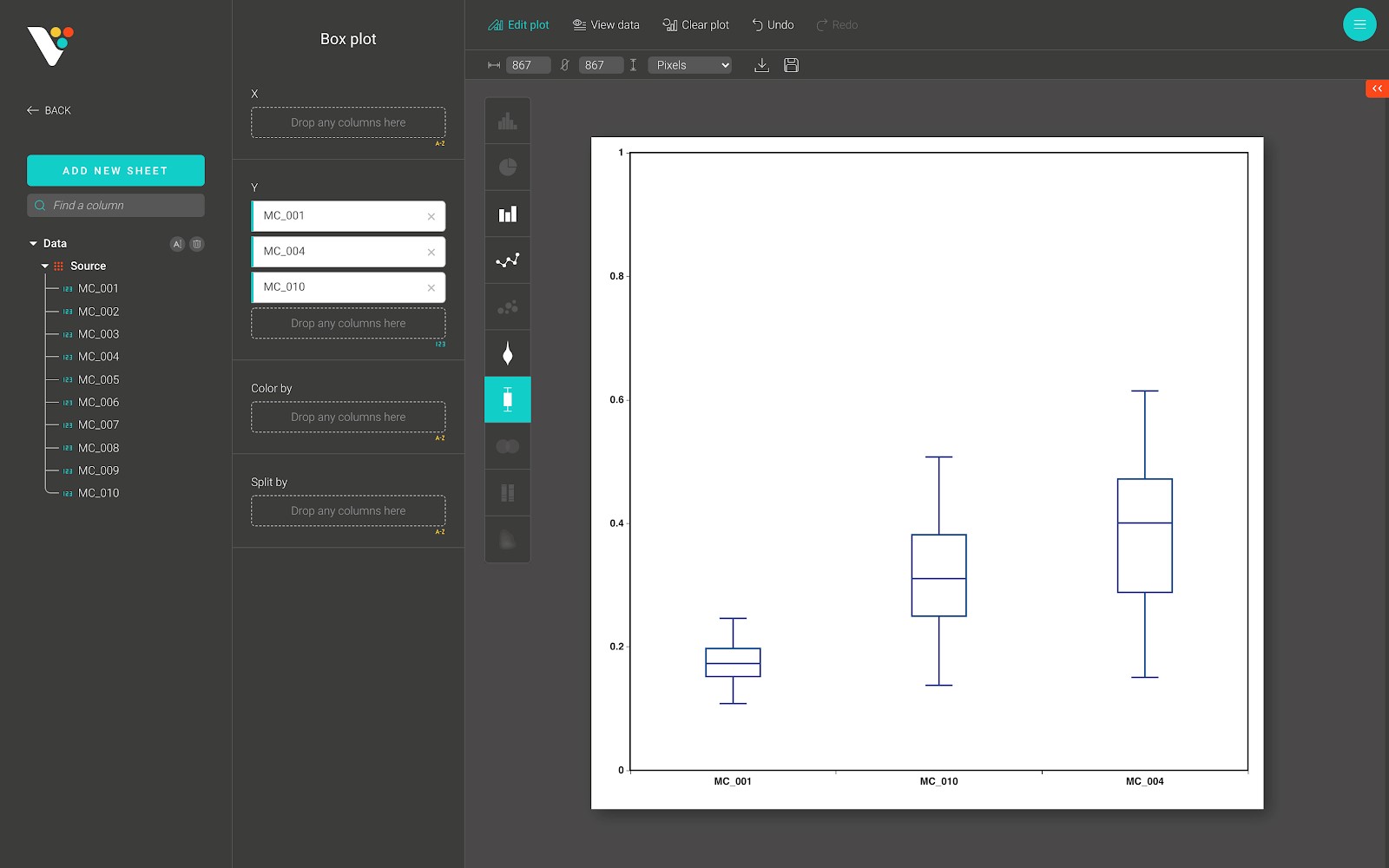
For advanced customization, go to the “Edit plot” dashboard, and click on the “Configuration” tab on the top right corner of the screen.
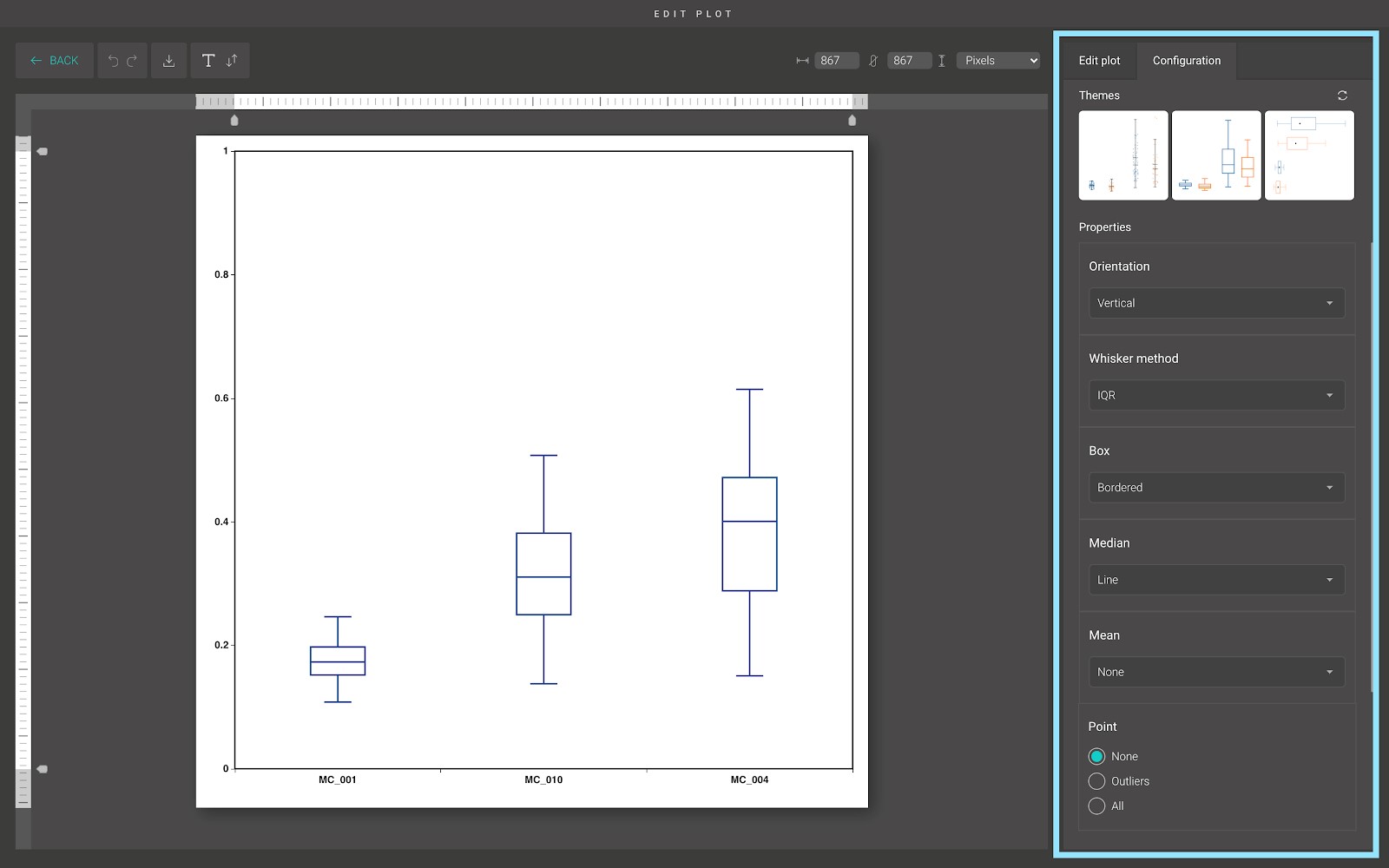
In the “Configuration” tab, we provide a set of themes to help you quickly customize your plot. Below the “Themes” section is the advanced configuration options. Including:
- Orientation:
You can plot the box plot vertically or horizontally by using this option.
- Whisker method:
This option allows you to specify the height of the whiskers, with two available methods:
- IQR: The distance between the lower/upper whisker and the Q1/Q3 value equals to 1.5 times the IQR. Any data not included between the whiskers should be treated as an outlier.
- Min-max: The distance between the lower/upper whisker and the Q1/Q3 value equals to the distance between the minimum/maximum value and the Q1/Q3 value. All data are included between the whiskers.
- Box:
This option allows you to choose how to display the box in the box plot.
- Median:
This option allows you to choose how to display the median in the box plot. You can display the median as a line, as a dot, or hide it.
- Mean:
This option allows you to choose how to display the mean in the box plot. You can display the mean as a line, as a dot, or hide it.
- Point, Point style, and Jitter:
These three options allow you to choose how to display data points in the box plot.
By default, the data points are hidden. You can display the outliers by clicking on the “Outliers” option, or display all of the data points by clicking on the “All” option.
When you choose to display all of the data points, it’s hard to see the density at a certain area in the box plot. BioVinci uses a plotting technique called “Jitter” to solve this problem.
Basically, in the “Jitter” technique, we give each data point a new x-axis value (or y-axis value if you are drawing a horizontal box plot). The new x-axis value (or y-axis value) lies within the width of the box. BioVinci support two “Jitter” methods:
- Random: Generate the new x-axis value (or y-axis value) randomly.
- Swarm: Generate the new x-axis value (or y-axis value) in a way that would-be overlapping points are separated such that each is visible
Violin
A violin plot is a method of plotting numeric data. It is similar to a box plot, with the addition of a rotated kernel density plot on each side.
Violin plots are similar to box plots, except that they also show the probability density of the data at different values, usually smoothed by a kernel density estimator. In BioVinci, we use the Gaussian kernel as the estimator and use Scott's rule as a “rule of thumb” to calculate the estimator bandwidth.
Below is a violin plot from BioVinci:
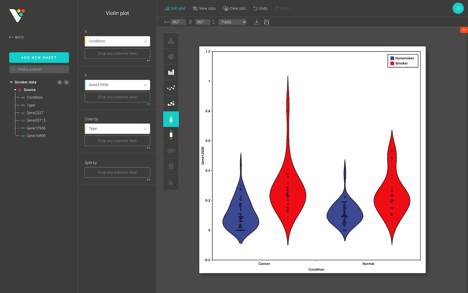
For advanced customization, go to the “Edit plot” dashboard, and click on the “Configuration” tab on the top right corner of the screen.
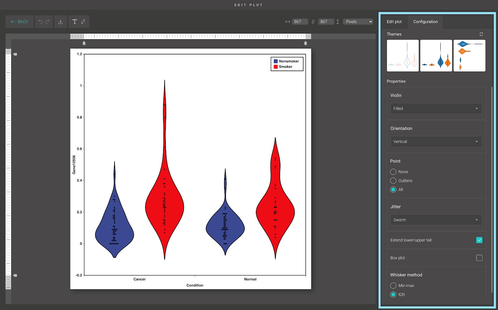
In the “Configuration” tab, we provide a set of themes to help you quickly customize your plot. Below the “Themes” section is the advanced configuration options.
- Violin:
This option allows you to choose how to display the “violin” in the violin plot. Two types are available: the filled “violin”, and the bordered “violin”.
- Orientation:
You can plot the violin plot vertically or horizontally by using this option.
- Point and Jitter:
These two options allow you to choose how to display data points in the box plot.
By default, all data points are hidden. You can display the outliers by clicking on the “Outliers” option, or display all of the data points by clicking on the “All” option.
When you choose to display all the data points, it’s hard to see the density at a certain area in the box plot. BioVinci uses a plotting technique called “Jitter” to solve this problem.
Basically, in the “Jitter” technique, we give each data point a new x-axis value (or y-axis value if you are drawing a horizontal box plot). The new x-axis value (or y-axis value) lies within the width of the box. BioVinci support two “Jitter” methods:
- Random: Generate the new x-axis value (or y-axis value) randomly.
- Swarm: Generate the new x-axis value (or y-axis value) in a way that would-be overlapping points are separated such that each is visible
- Extend lower/upper tail:
If you tick on this option, BioVinci will extend the range of the data points for better visualization.
- Box plot:
Tick on this option to show the “little” box plot inside the violin.
- Whisker method
This option allows you to specify the height of the whiskers of the box plot inside the violin, with two available methods:
- IQR: The distance between the lower/upper whisker and the Q1/Q3 value equals to 1.5 times the IQR. Any data not included between the whiskers should be treated as an outlier.
- Min-max: The distance between the lower/upper whisker and the Q1/Q3 value equals to the distance between the minimum/maximum value and the Q1/Q3 value. All data is included between the whiskers.
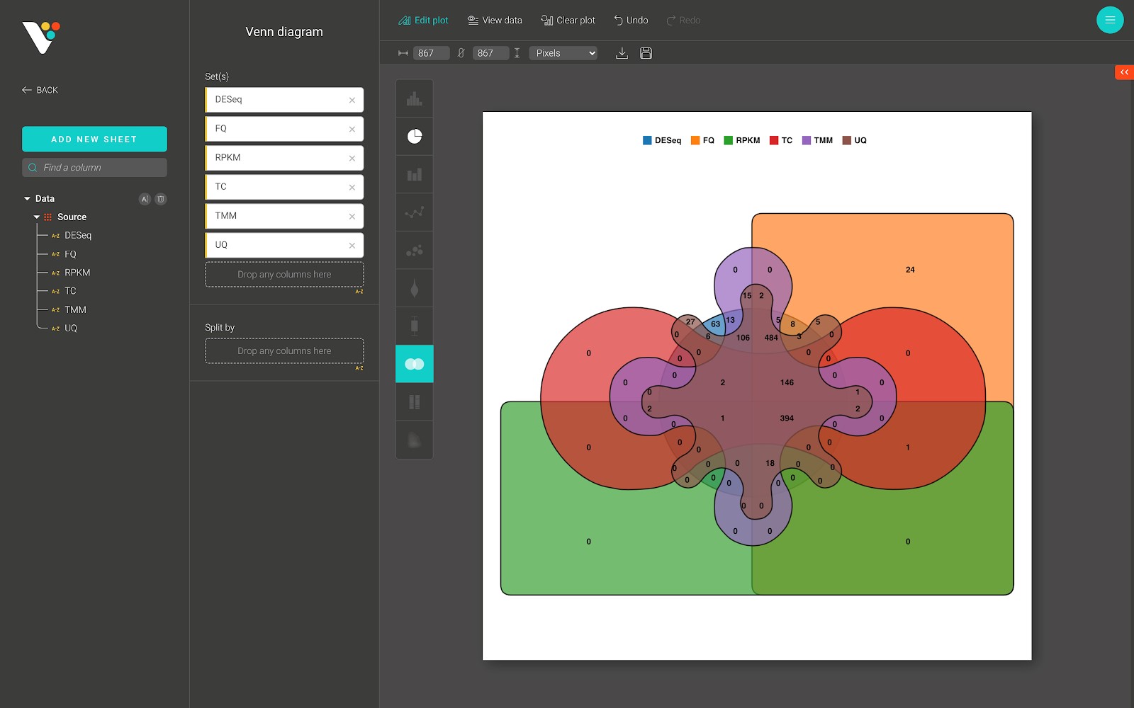
Venn diagram
A Venn diagram is a diagram that shows all possible logical relations between a finite collection of different sets.
BioVinci supports a Venn diagram of 2, 3, 4, 5, and 6 different sets. Below is a Venn diagram from BioVinci:
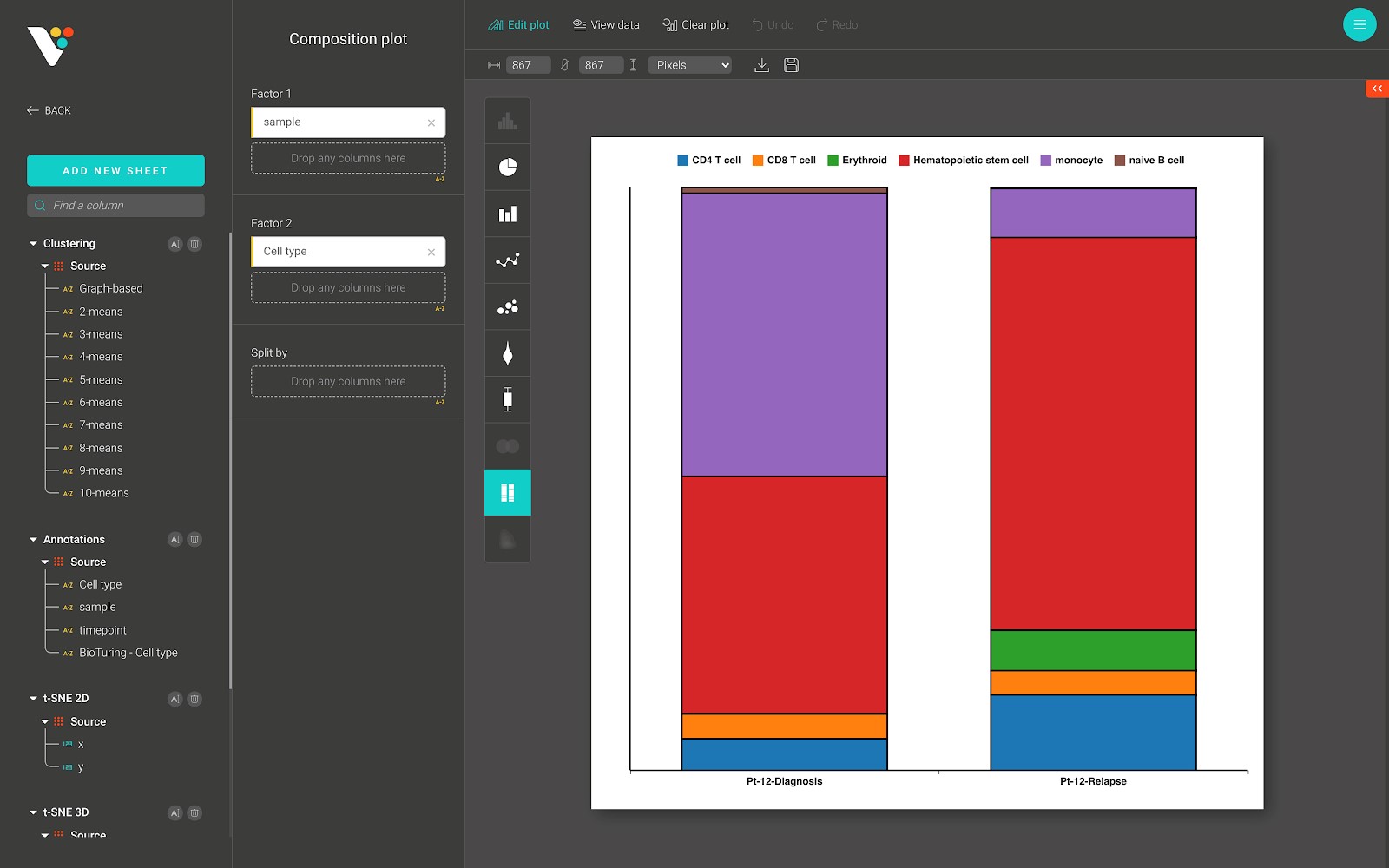
Composition plot
The composition plot (also called the stacked bar plot) stacks bars that represent different groups on top of each other. The height of the resulting bar shows the combined result of the groups.
Below is a composition plot from BioVinci, which shows the proportion of cell types in each sample.
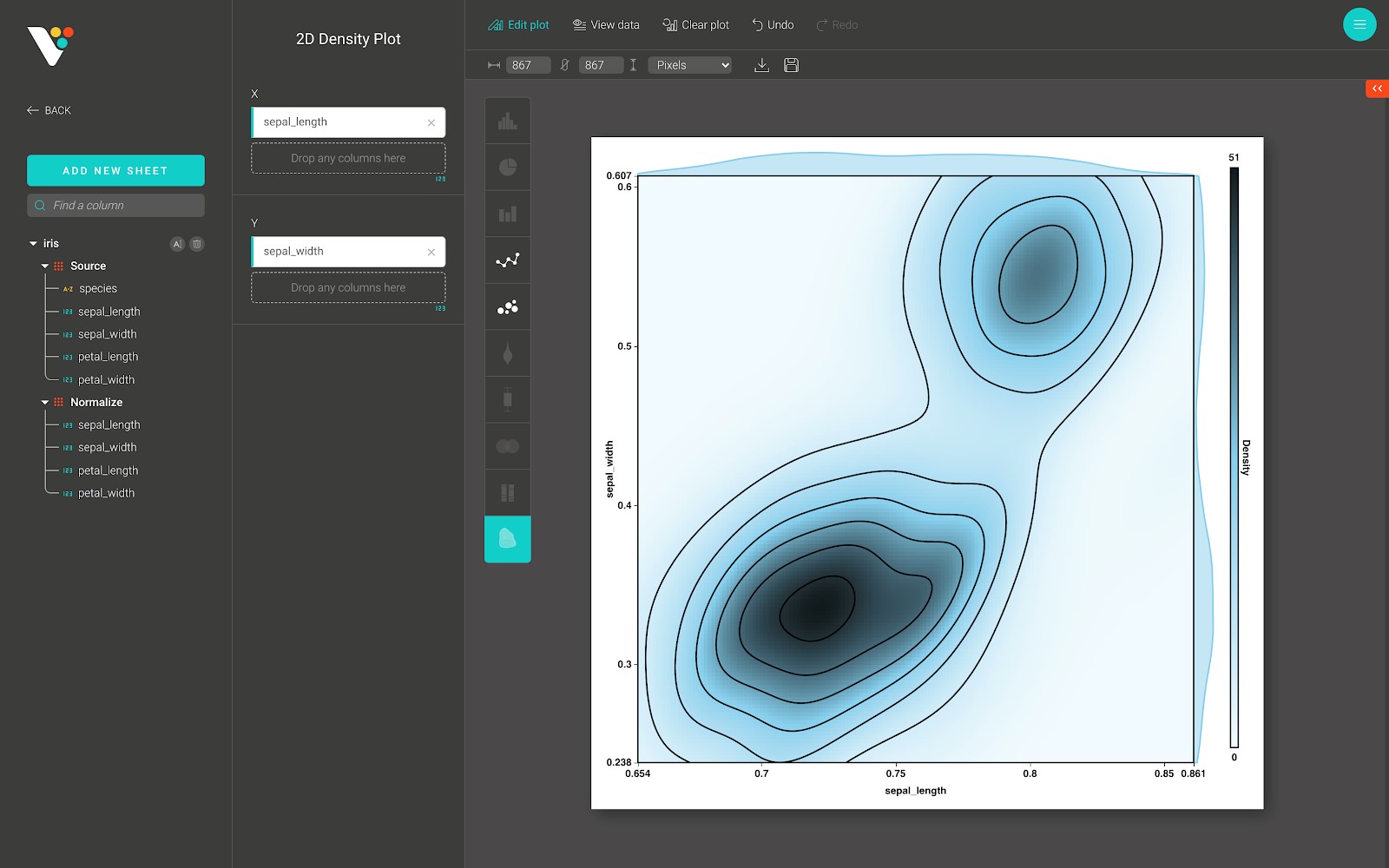
2D Density plot
A 2D histogram is a 2-dimensional plot using Cartesian coordinates computed by grouping a set of points specified by their x and y coordinates into bins and counting the total number of points that fall into each bin to compute the color of the tile representing the bin.
This kind of visualization (and the related 2D histogram contour, or density contour) is often used to manage over-plotting, or situations where showing large data sets as scatter plots would result in points overlapping each other and hiding patterns.
Below is a 2D Density plot from BioVinci:
Dimensionality reduction
Overview
Dimensionality reduction is the transformation of data from a high-dimensional space into a low-dimensional space so that the low-dimensional representation retains some meaningful properties of the original data, ideally close to its intrinsic dimension. Working in high-dimensional spaces can be undesirable for many reasons; raw data are often sparse as a consequence of the curse of dimensionality, and analyzing the data is usually computationally intractable. [See more on Wikipedia’s page for dimensionality reduction]
BioVinci incorporates state-of-the-art algorithms for dimensionality reduction, including PCA, ISOMAP, t-SNE, UMAP. When the data contain a “label” column, BioVinci will find an optimal algorithm to perform on your data using the Silhouette score.
Silhouette refers to a method of interpretation and validation of consistency within clusters of data. The silhouette value is a measure of how similar a sample is to its cluster (cohesion) compared to other clusters (separation). The silhouette ranges from −1 to +1, where a high value indicates that the object is well matched to its cluster and poorly matched to neighboring clusters. If most objects have a high value, then the clustering configuration is appropriate. If many points have a low or negative value, then the clustering configuration may have too many or too few clusters.
Data preprocessing
“None”: Your data is original
“Normalize”: Normalization calculates the norm of each sample (row vector) in the data and divides the value of each sample by its norm.
“Standardize”: Standardization involves calculating the mean (u) and the standard deviation (s) of each feature (column vector) and transforming the values in each column to (x-u)/s.
BioVinci 2.0 sets normalization as the default parameter for preprocessing some types of data as single-cell RNA, bulk RNA, miRNA expression... For other data types, we suggest using standardization when features have many different levels of variance. On the other hand, if you like to remove the influences of confounding factors that lead to the differences among samples in your input data, the normalization is more suitable. Below is the parameters’ description of each method.
Principal component analysis
- Maximum number of features: Number of components to keep.
- SVD (singular value decomposition):
“Auto”: If the input data is larger than 500x500 and the number of components to be extracted is lower than 80% of the smallest dimension of the data, then the more efficient ‘randomized’ method is enabled. Otherwise, the exact full SVD is computed and optionally truncated afterward.
“Full”: Runs exact full SVD calling the standard LAPACK solver via scipy.linalg.svd and selects the components by postprocessing.
“Arpack”: Runs SVD truncated to n_components calling ARPACK solver via scipy.sparse.linalg.svds. It requires strictly 0 < n_components < min(n_sample of X, n_feature of X).
“Randomized”: Runs randomized SVD by the method of Halko et al, 2009. These methods use random sampling to identify a subspace that captures most of the action of a matrix. In many cases, this approach outperforms its classical competitors in terms of accuracy, speed, and robustness.
Reference:
https://arxiv.org/pdf/0909.4061.pdf
https://scikit-learn.org/stable/modules/generated/sklearn.decomposition.PCA.html
ISOMAP
- Number of neighbors: number of neighbors to consider for each point.
- Path method:
- Method to use in finding the shortest path.
- “auto”: attempt to choose the best algorithm automatically.
- “FW”: Floyd-Warshall algorithm.
- “D”: Dijkstra’s algorithm.
- Eigen solver:
- “auto”: Attempts to choose the most efficient solver for the given problem.
- “arpack”: Uses Arnoldi decomposition to find the eigenvalues and eigenvectors.
- “dense”: Uses a direct solver (i.e. LAPACK) for the eigenvalue decomposition.
- Neighbors algorithm:
- Algorithm to use for nearest neighbor search passed to neighbors. NearestNeighbors instance.
t-distributed Stochastic Neighbor Embedding
- Method:
- By default the gradient calculation algorithm uses Barnes-Hut approximation running in O(NlogN) time. method = ”exact” will run on the slower, but exact, the algorithm in O(N^2) time.
- Initialize:
- Initialization of embedding. Possible options are ‘random’, ‘PCA’, and a numpy array of shape (n_samples, n_components). PCA initialization cannot be used with precomputed distances and is usually more globally stable than random initialization.
- Perplexity:
- The perplexity is related to the number of nearest neighbors that are used in other manifold learning algorithms. Larger datasets usually require a larger perplexity. Consider selecting a value between 5 and 50. Different values can result in significantly different results.
- Learning rate:
- The learning rate for t-SNE is usually in the range [10.0, 1000.0]. If the learning rate is too high, the data may look like a ‘ball’ with any point approximately equidistant from its nearest neighbors. If the learning rate is too low, most points may look compressed in a dense cloud with few outliers. If the cost function gets stuck in a bad local minimum increasing the learning rate may help.
- Number of iterations:
- The maximum number of iterations without progress before we abort the optimization, used after 250 initial iterations with early exaggeration. Note that progress is only checked every 50 iterations so this value is rounded to the next multiple of 50.
- Theta:
- Only used if method=’barnes_hut’. This is the trade-off between speed and accuracy for Barnes-Hut T-SNE. ‘angle’ is the angular size (referred to as theta) of a distant node as measured from a point. If this size is below ‘angle’ then it is used as a summary node of all points contained within it. This method is not very sensitive to changes in this parameter in the range of 0.2 - 0.8. An angle less than 0.2 has quickly increasing computation time and an angle greater 0.8 has quickly increasing error.
UMAP
- Number of neighbors:
- The size of the local neighborhood (in terms of the number of neighboring sample points) used for manifold approximation. Larger values result in more global views of the manifold, while smaller values result in more local data being preserved.
- The minimum distance between embedded points:
- Smaller values will result in a more clustered/clumped embedding where nearby points on the manifold are drawn closer together, while larger values will result in a more even dispersal of points. The value should be set relative to the spread value, which determines the scale at which embedded points will be spread out.
- Metric:
- A metric is a function used to compute distances in high dimensional space.
Analyzing data with heatmap
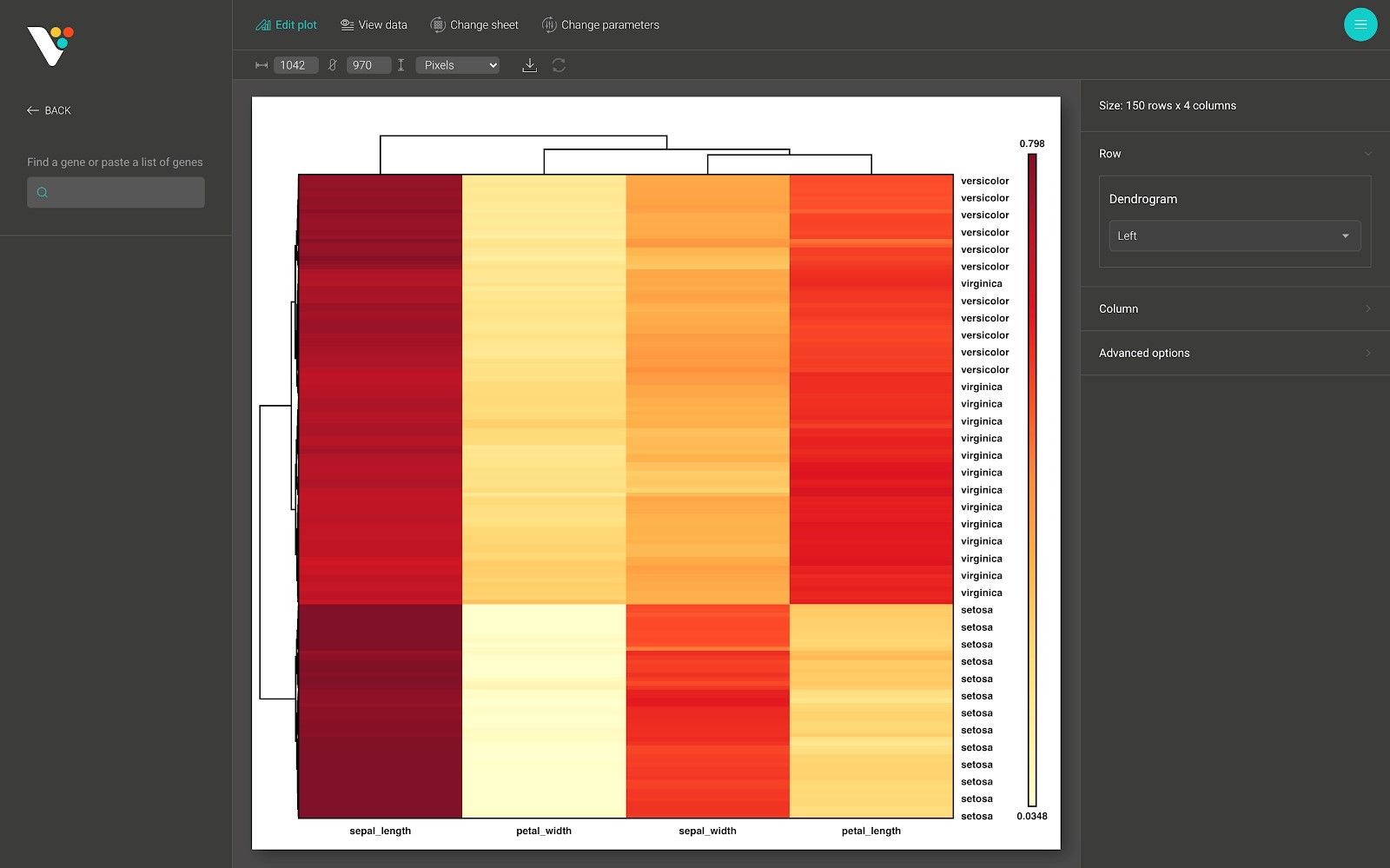
A heat map (or heatmap) is a data visualization technique that shows the magnitude of a phenomenon as color in two dimensions. It is the most intuitive and straightforward way to visualize tabular data.
In BioVinci, we provide an interactive and easy to customize heatmap. To create a heatmap with BioVinci, follow the instructions below.
Input data
See Section 4: Importing data.
The row/column annotation
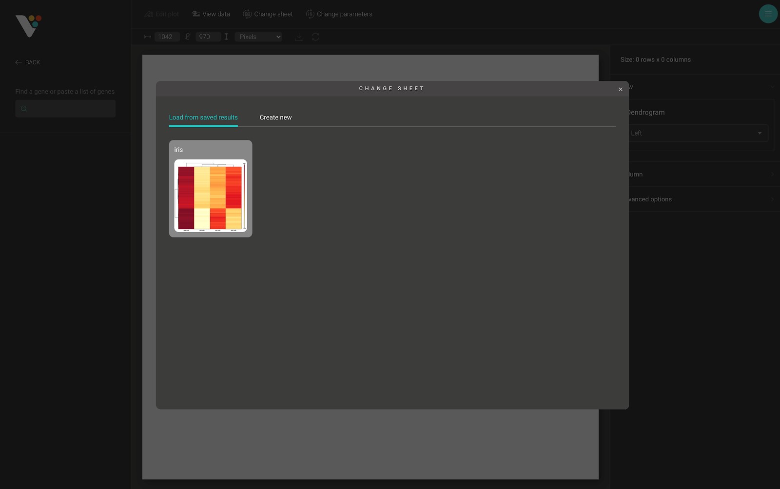
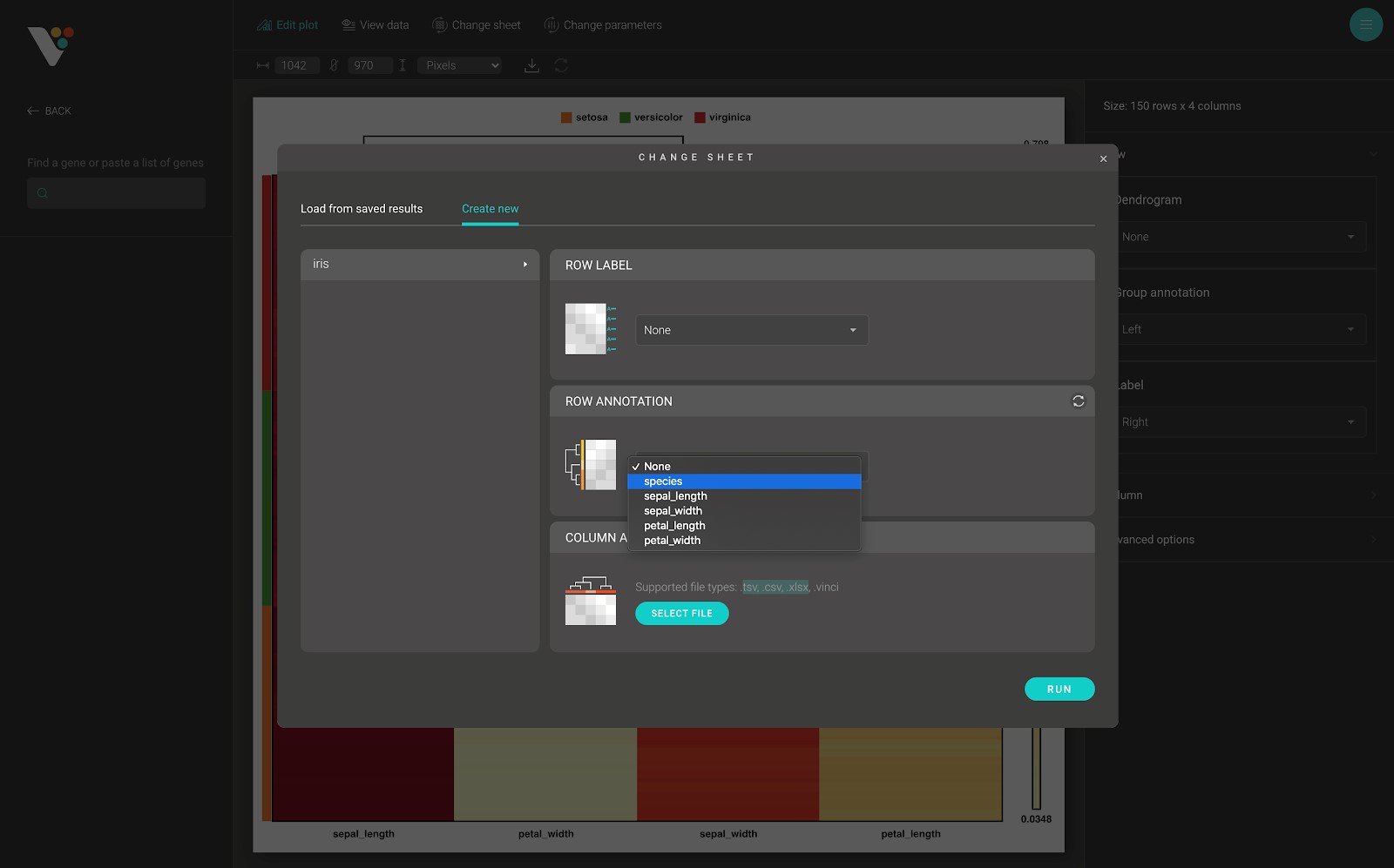
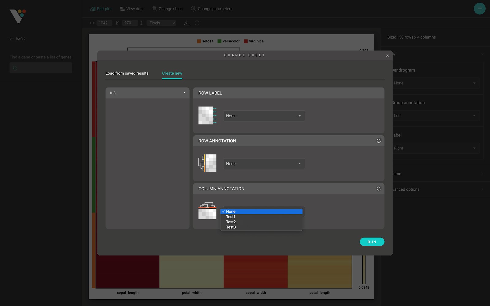
After submitting your data in BioVinci and navigating to the heatmap dashboard, a dialog appears. In this dialog, you can quickly access your saved results, or create a new heatmap using the “Load from saved results” tab and the “Create new” tab.
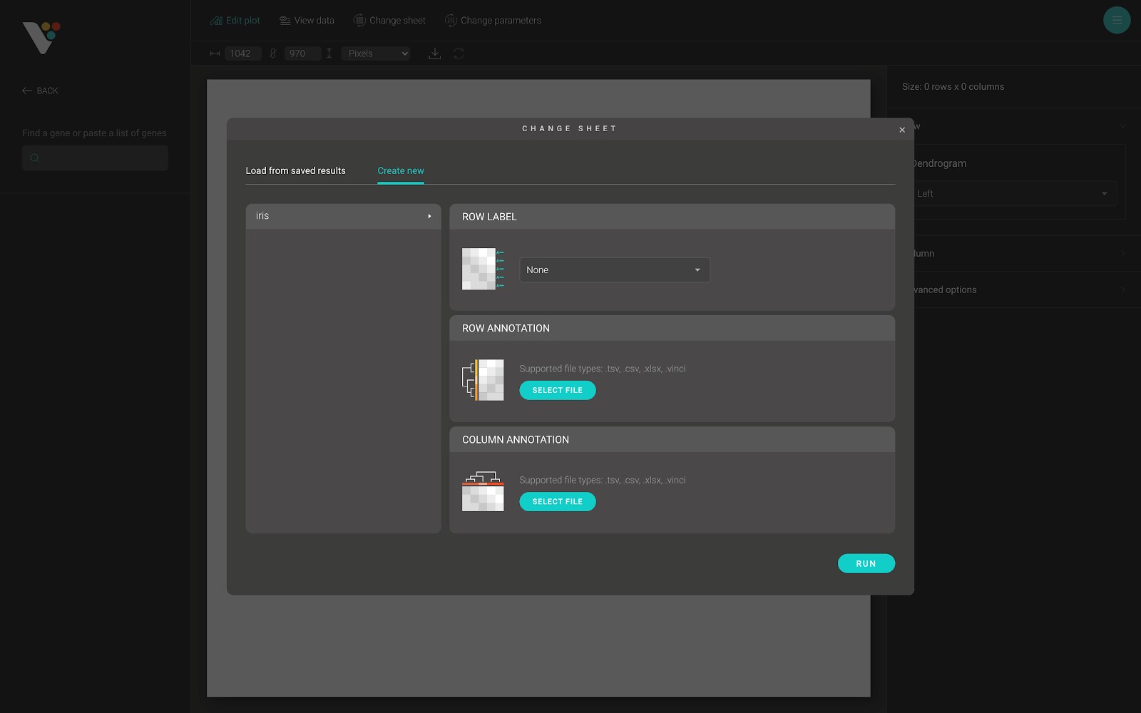
The “Create new” tab has two main sections. The first section is on the left side of the dialog. From here, you can select the sheet used to draw the heatmap. The second section has there parts, including:
- Row label: The row label of the heatmap. As in the figure below. You can select any of the string columns from your selected sheet to use as a row label of the heatmap.
- Row annotation: The row annotation of the heatmap. As in the figure below:
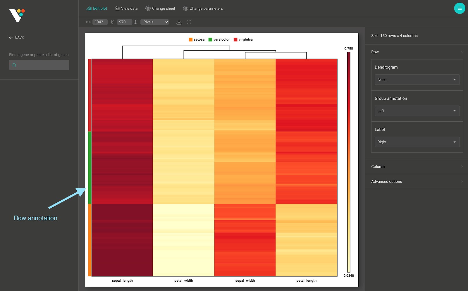
- Row annotation in BioVinci is a categorical group of the samples (the observations or the rows) from your data. These bars are color-coded to represent a particular grouping.
- The row annotation data input in BioVinci requires a .tsv, or .csv, or .xlsx file which contains one or many text columns, with the number of rows in each column equals the number of rows (samples, observation) in your data. After submitting the row annotation file, a select box appears, and you can select the row annotation grouping that you want to apply to your heatmap.
- Column annotation:
- Column annotation in BioVinci is a categorical group of the features (the variables or the columns) from your data. These bars are color-coded to represent a particular grouping.
- The column annotation data input in BioVinci requires a .tsv, or .csv, or .xlsx file which contains one or many text columns, with the number of rows in each column equals the number of columns (variables, features) in your data. After submitting the column annotation file, a select box appears, and you can select the column annotation grouping that you want to apply to your heatmap.
Interacting with BioVinci heatmap
After creating a heatmap with BioVinci, you can interact with the generated heatmap in several ways:
- Drag your mouse on to the heatmap to zoom in a specific region to view hidden patterns.
- Draw a subset of your heatmap by searching for a specific set of rows/columns.

- Show/hide the row dendrogram and the row group annotation:
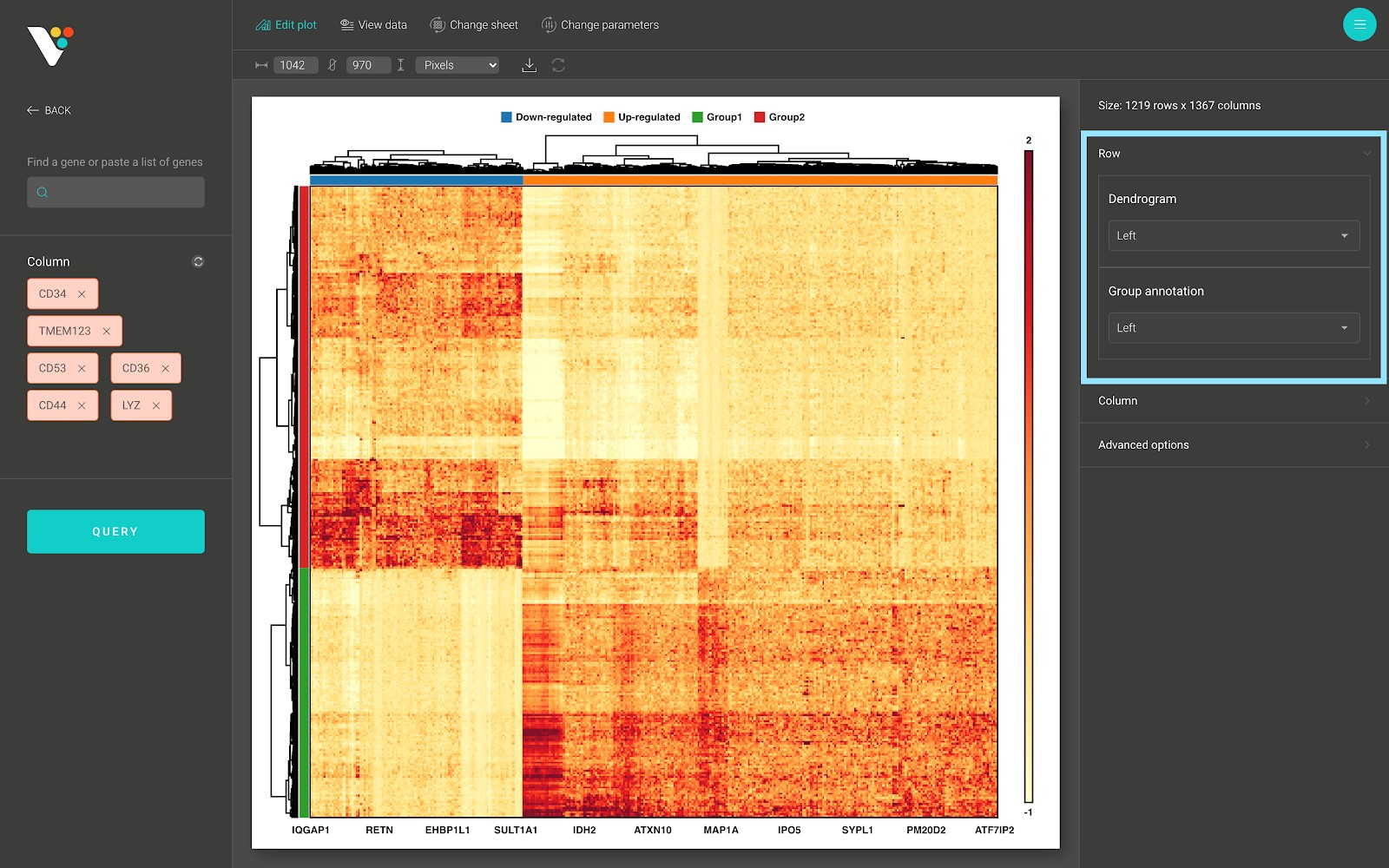
- Show/hide the column dendrogram and the column group annotation:
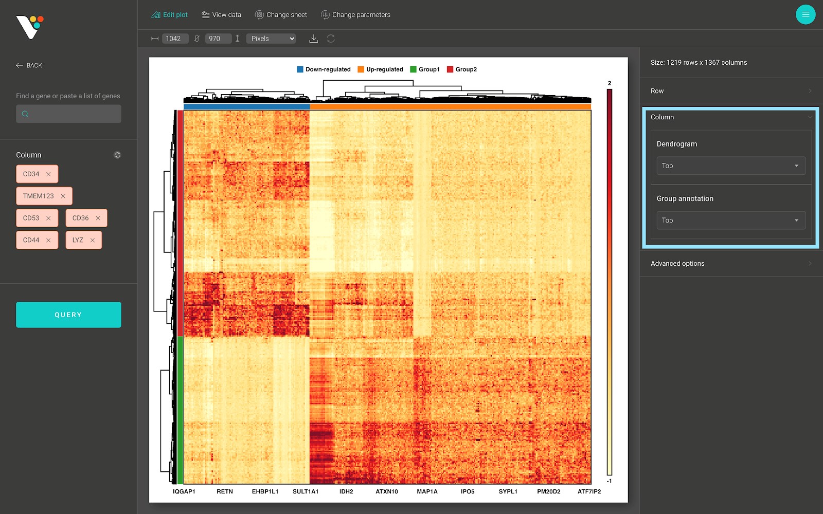
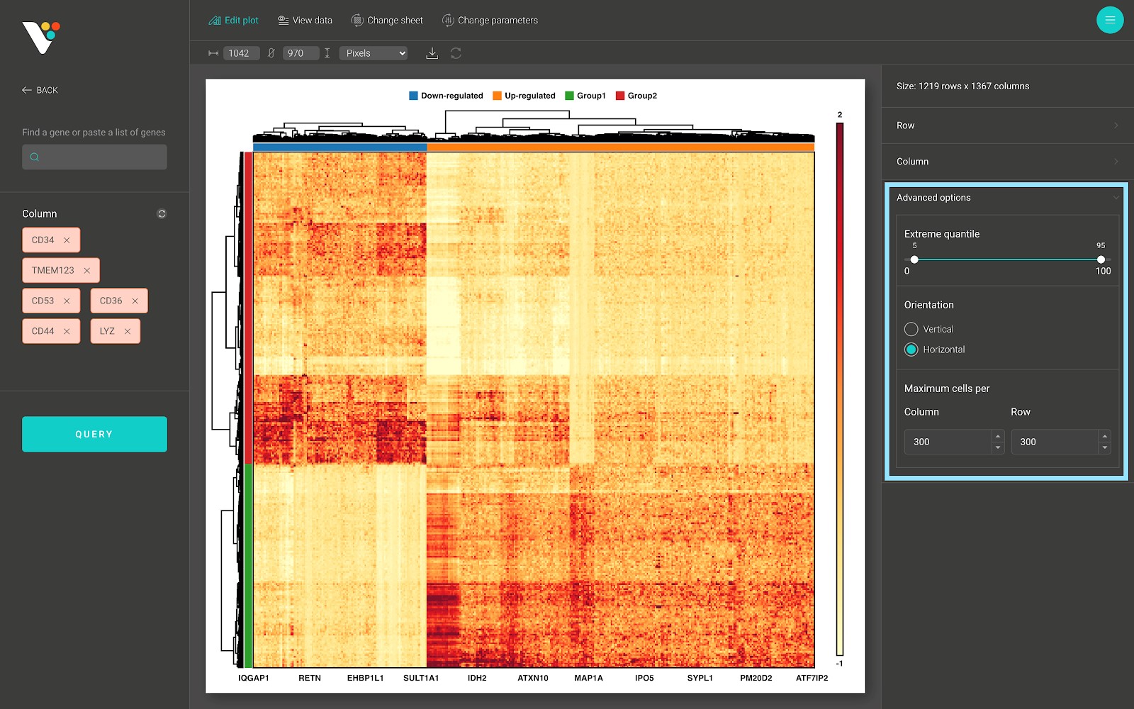
- In the advanced options panel, you can scale the range of your data to remove the effect of the outliers onto the heatmap color scale, or rotate your heatmap.
Changing the parameters
On top of the screen is the toolbar. Click on the “Change parameters” button to show the “Change parameters” dialog.
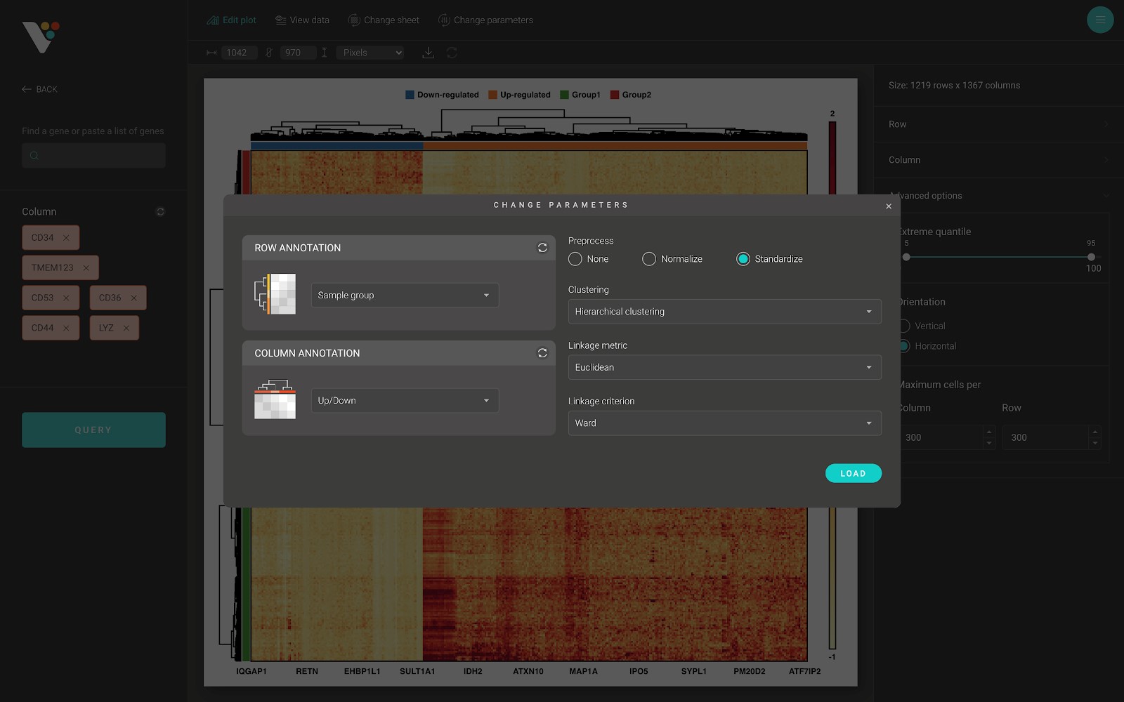
From here, you can change the row/column annotation, or change the data preprocessing method, or change the hierarchical clustering options, including:
- Clustering: Two available options: “Hierarchical clustering” and “None”. Choose “Hierarchical clustering” to perform hierarchical clustering on your data.
- Linkage metric: The distance metric to use while performing hierarchical clustering.
- Linkage criterion: The linkage criterion determines which distance to use between sets of observations. The algorithm will merge the pairs of clusters that minimize this criterion. BioVinci support several criterions:
- “Ward”: minimizes the variance of the clusters being merged.
- “Average”: uses the average of the distances of each observation of the two sets.
- “Complete”: uses the maximum distances between all observations of the two sets.
- “Single”: uses the minimum of the distances between all observations of the two sets.